
Jewelry ECOMM Tech


When Cleverness Ruins Your Website September 24, 2018 (0 comments)
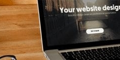 I spoke to a gentleman recently who showed me an absolutely stunning website. Stunning, in fact, is an understatement. Clicking on a button would cause the site’s menu to animate in an incredibly visual way, with animations popping up as you hovered over each button. Fantastic typography, stunning full screen videos that were made specifically for the site, and a brilliant sense of overall design filled the site.
I would probably guess that a major creative agency built this site for $100,000. However, I don’t know what this site is about.
The incredible, minimalist design was actually hurting the user experience. For example, I loved playing with the site’s menu and animations. As a designer myself, I really respected the work. But this gorgeous menu was not labeled clearly, and it took me a legitimate 10 minutes to even figure out what type of business this was.
Presumably, the team decided to use trendy words because it went with the overall cool, mysterious design of the site. But a simple welcome paragraph as the website loaded would have explained all I needed to know.
This is the fine line your website needs to straddle. A great website developer knows how important sharp graphics and branding are for each website. But being creative is also a curse - it can be very easy for us to get carried away with trying to make our work too cool or too interesting at the cost of clarity.
I think it’s awesome to try to do something interesting with your site. But most visitors have a bit of an expectation of what most websites will look like (header at the top, menu under it, sidebar on the right, etc) because they use the web on a regular basis. Keep this in mind when you’re redesigning your site. Make it stunning, but don’t throw your user off too much.
Great design is supposed to amplify the user’s experience - not hurt it.
I spoke to a gentleman recently who showed me an absolutely stunning website. Stunning, in fact, is an understatement. Clicking on a button would cause the site’s menu to animate in an incredibly visual way, with animations popping up as you hovered over each button. Fantastic typography, stunning full screen videos that were made specifically for the site, and a brilliant sense of overall design filled the site.
I would probably guess that a major creative agency built this site for $100,000. However, I don’t know what this site is about.
The incredible, minimalist design was actually hurting the user experience. For example, I loved playing with the site’s menu and animations. As a designer myself, I really respected the work. But this gorgeous menu was not labeled clearly, and it took me a legitimate 10 minutes to even figure out what type of business this was.
Presumably, the team decided to use trendy words because it went with the overall cool, mysterious design of the site. But a simple welcome paragraph as the website loaded would have explained all I needed to know.
This is the fine line your website needs to straddle. A great website developer knows how important sharp graphics and branding are for each website. But being creative is also a curse - it can be very easy for us to get carried away with trying to make our work too cool or too interesting at the cost of clarity.
I think it’s awesome to try to do something interesting with your site. But most visitors have a bit of an expectation of what most websites will look like (header at the top, menu under it, sidebar on the right, etc) because they use the web on a regular basis. Keep this in mind when you’re redesigning your site. Make it stunning, but don’t throw your user off too much.
Great design is supposed to amplify the user’s experience - not hurt it.