Articles and News
Easy Tips For Creating Signage That Sells | October 16, 2019 (0 comments)
Little Rock, AR—Every store needs signage with a message that sells. The problem is, ready-made signs that work well for your store can be hard to find, and jewelers often shy away from homemade signs.
That’s a mistake, says jeweler Laura Stanley. At the recent Arkansas Jewelers Association convention in September, Stanley, Laura Stanley Personal Jeweler, Little Rock, AR heard something inspiring and useful from speaker/presenter Larry Johnson, CEO of Larry Johnson Consulting Services, a visual merchandising advisory firm based in Colleyville, TX.
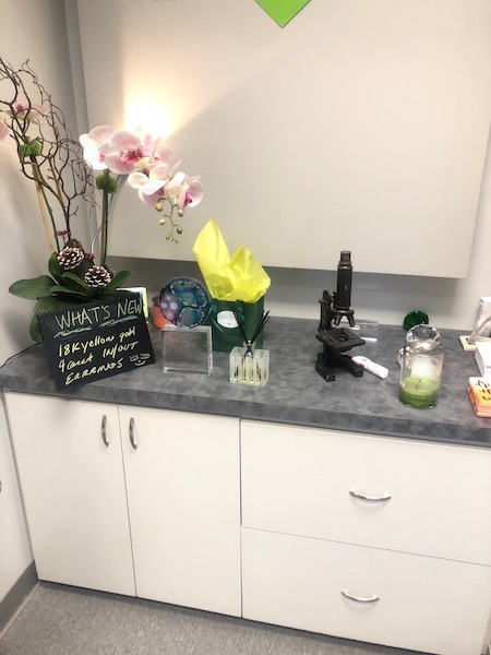
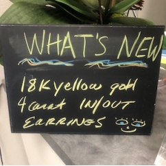
“When I returned, I thought about my cute little chalkboard and thought ‘I could make a sign,’ said Stanley. “I got out some colored chalk I’d never used and got busy. But then I realized I had no place to put it!”
Stanley just set it on a shelf next to some other things for the moment while she thought about how to rearrange her displays to accommodate the sign. It was in a spot not easily visible to anyone walking by, but Stanley says just two hours later, a lady came in and asked about the earrings mentioned on the sign!
“I had written in/out diamond hoops on the sign. She asked me what that meant—if they were in or out of style? I tried to explain and then showed her the earrings and she bought them. She was a regular customer, but I would never have thought of showing her a pair of four-carat inside-out earrings.”
The Centurion connected with Larry Johnson to find out more about the signage. His firm works with independent retailers around the world to improve the presentation of their merchandise. Turns out, he had a lot of smart signage advice he was willing to share.
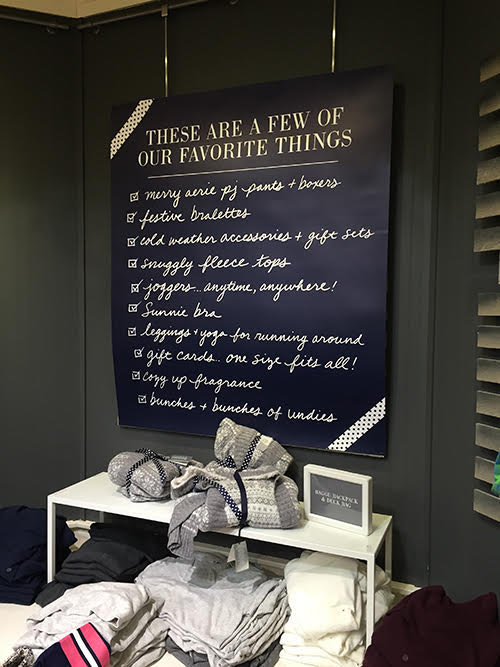
Johnson suggested a derivation of something he saw while shopping with his wife at a high-end women’s lingerie boutique in the Dallas/Fort Worth area. It was a blackboard sign mounted on the wall, titled “These Are a Few of Our Favorite Things.” Naturally, there followed a list of some items for sale to draw attention to those pieces.
“I thought it was neat. My wife was taken by the things listed there, and made a purchase. I looked at the concept and decided to tweak it to work for an independent jeweler.”
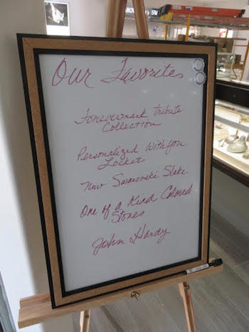
For signage, Johnson recommends going to an office supply store and getting a white board (18 by 24 inches) and an easel and colorful white board markers. Have someone in the store (ideally the employee with the best handwriting!) keep the signage fresh and up-to-date with a list of jewelry for sale. Johnson has long promoted a Top 10 list to his clients where they could promote specific inventory to customers.
So perhaps it’s a Top 10 list. Perhaps it’s new inventory from a new designer. Perhaps it’s a mature item that needs a new home. The sign’s contents should reflect your store’s marketing direction, according to Johnson.
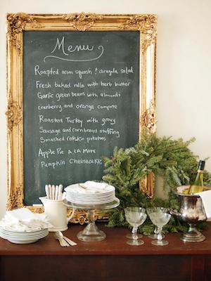
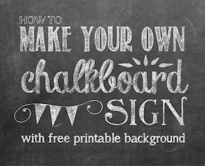
If a white board seems too, well, boardroom, you could opt for a chalkboard like Stanley did. If you can’t find a suitable one for your décor, you can make one yourself. Click here for instructions to make an ornate framed one (or have a local framing shop make one for you.) If you’re concerned about chalk dust and allergies, click here for instructions to make a chalkboard-style printed sign on your computer.
A chalkboard can be simple, like Stanley's, or ornate, like this one here. Image: HGTV. Right, YellowBlissRoad.com has instructions to print out a chalkboard-style sign from your computer, with a free printable background.
“[Handwritten board signs] have worked well for a lot of clients,” Johnson says. Through the signage, Johnson wants a store to be able to communicate to clientele that they have an organic business whose inventory is constantly evolving. Having the sign always showing different inventory helps the customer to realize that the store is continually restocking and isn’t the same store you visited a month ago for a watch battery.
Johnson further refined the concept based on a dinner out with friends. “The restaurant we visited had a specials board. When the special was gone, the restaurant did not erase the item – they drew a line through it.”
Johnson watched his friends comment on the item that was no longer available. “They all thought the item they could no longer order would have been good. Then one of them said, “We’ll just have to come here earlier next time.” So Johnson suggests evolving the signage into a ‘What’s New’ board to keep that strategy working.
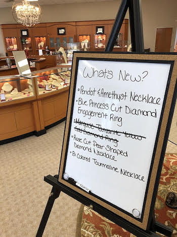
So, says Johnson, if a diamond and sapphire pendant (for instance) sells, draw a line through it. When that customer comes in and says ‘Gosh, I wish I had seen it,’ show them a photo and let them know you can get another one. This shows again that inventory moves quickly and customer should visit often.
That’s a sign of the times!
