
Articles and News


How To Post, Boost, And Get Maximum Impact From A Great Graphic On Facebook | August 12, 2015 (0 comments)
Merrick, NY—Let’s say you’ve got a fun graphic or great ad that you want to post on Facebook. You post it. You even pay $5 or $20 or more to ‘boost’ your graphic to your targeted audience because you know they will love it. You expect big reach, since your know your audience will send it to their friends, further boosting your post. You excitedly check your post reach the next day, only to find out that it only reached 72 people instead of the many hundreds (or thousands) you were expecting. Clearly your plan did not work.
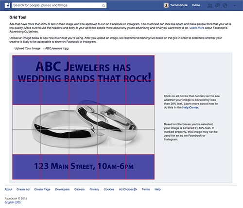
What went wrong? Likely you had too much text on your post – or it was in the wrong place! Luckily, Facebook’s grid tool can help you find out if your text-to-image proportion and placement are correct. (Here’s a link to Facebook’s policy info.)
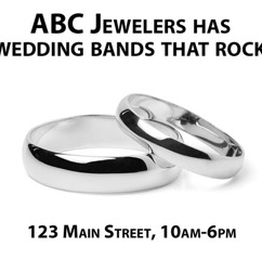
Let’s take a look. With your ad, left, here's how to maximize your impact.
So you upload your image and follow Facebook’s grid tool. You mark the text boxes that have text and find out that you have 60% text (what's in the purple shaded area), much more than Facebook’s 20% limit.
So, time to rearrange your ad (below top) and make it work. Let’s try this one and add the logo since we have more room (ABC’s logo is shown in purple; it’s a logo--i.e., an image--not text):

Now look at the Facebook grid placed over the new ad. Now it is within the 20% text guide. Of course, the 20% rule also depends largely on placement, so you can see how re-arranging and sizing text can really make a difference.

So go. Create. Test. And reap the rewards.