Articles and News
Leslie McGwire: Jewelry Store Remodeling Ideas | July 22, 2022 (0 comments)
West Bloomfield, MI--The great new is there are more independent jewelry stores enlarging their space than closing them, meaning it is as important as ever to make a good impression with your exterior and interior designs. Often when I do design consultation with remodeling or enlarging jewelry stores there is one essential question I receive: What percentage should be the showroom versus the back office? My answer is the 80/20 rule. Jewelry owners want to maximize the showroom space because that is revenue generating. So, 80% is generally specified for the showroom, while 20% is for the back office.
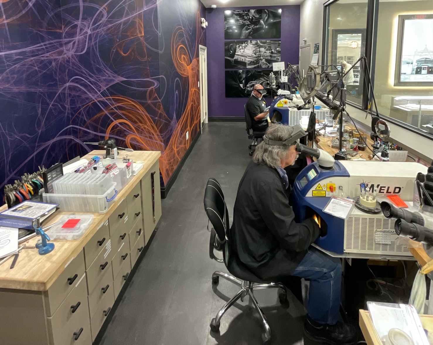
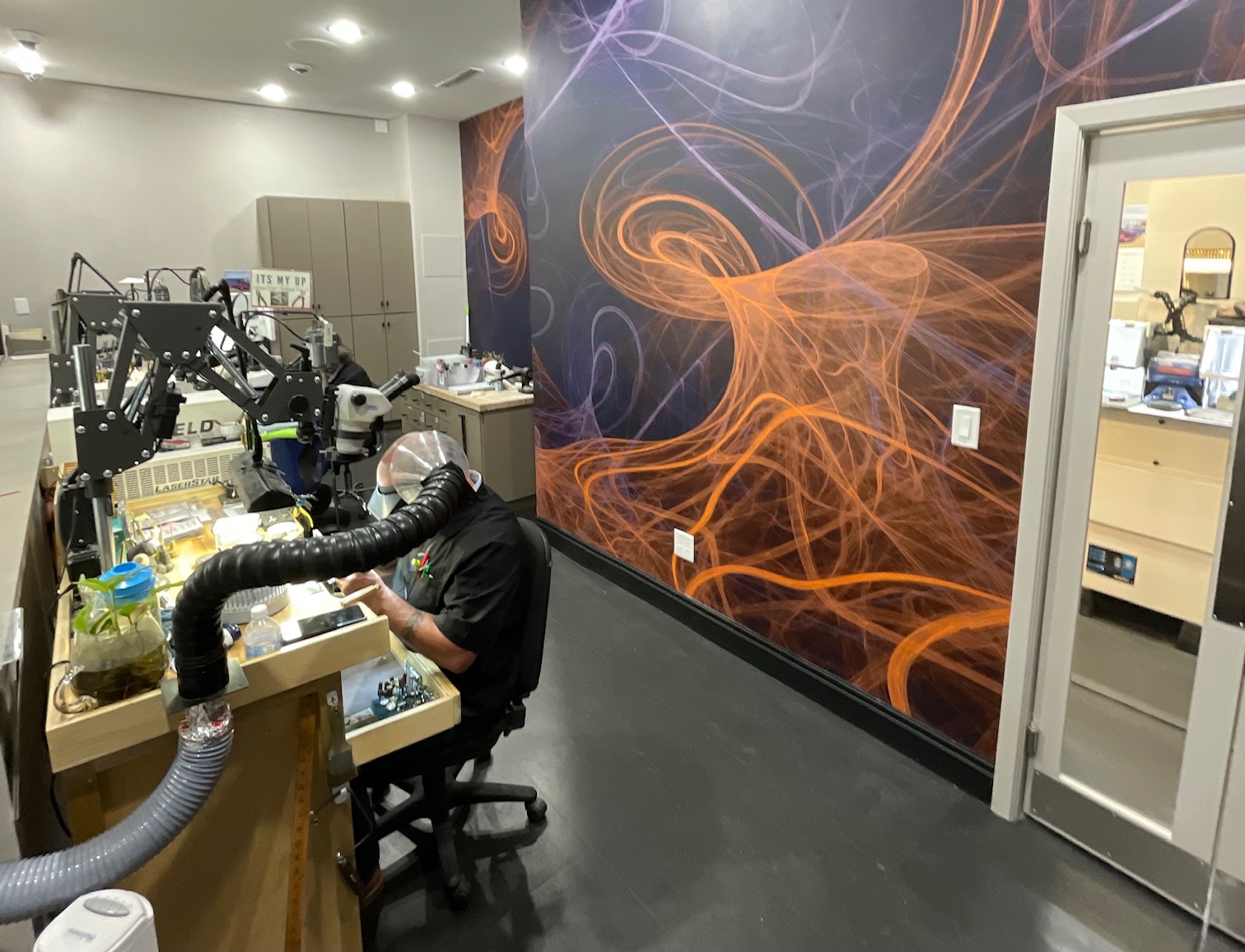
Back Office Designs. Jewelry renovation ideas for back office includes making sure you have a strong layout. These tips will help to reduce the back office of the jewelry store where it really counts. These spaces are not money generating for overall income. I designed Occasions Fine Jewelry store back shop to follow that guideline. With clients looking into the back shop through a large window behind POS. See below pictures of Occasions Fine Jewelry. I designed the room to look like an eye-catching space. The purple and orange are Occasions Fine Jewelry are their logo colors. This is a custom wall covering for the store.
Pay Special Attention to the Entrance. The entry area, also known as the “decompression zone,” is the first five to fifteen feet of space customers see when walking into your store. This area transitions client from the chaos of the outside world and allows them to focus on the shopping experience. When they step into your space, a client makes critical judgments about your brand based on your lighting, fixtures, and color schemes, etc. It is important to make a great first impression, so make sure to draw their eyes to a focal point: the jewelry show cases, wall cases, or a stunning chandelier to name a few.
Create a Path for Clients to Follow. “The feet will always follow the eyes,” Paco Underhill explains. “Strategically placing focal points throughout the store gets clients into and around the store effortlessly.” Depending on the size of your showroom space, owners may want to incorporate both wide and narrow aisles in the showroom. Wide aisles allow clients to walk quickly to a particular jewelry case, while narrow aisles give a different feeling to the space.
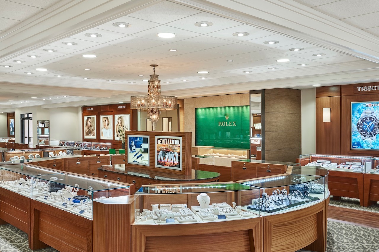
Add or Remove Walls. Jewelry showrooms typically are an open floorplan. See Martin Binder Jeweler showroom picture with no walls and designed as an open floorplan. Sometimes, I would recommend knocking down walls to reduce visual barriers. But before jewelry owners grab the sledgehammer; I would always recommend checking with a contractor to make sure it is not a load bearing wall. Partition walls promotes client’s interest in having a few niches in the space to feature special jewelry.
These are only a few important design ideas regarding space planning that I hope you will with your new or remodeled showroom. The ideas will generate and boost your bottom line.
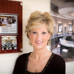
About the Author: Leslie McGwire™ has over 35 years in business development, interior design, equipment, furniture sales and marketing services in retail and jewelry-based businesses. Leslie has won 25 national design awards, including the prestigious Salon Today and INSTORE Jewelry Store awards. Leslie has a true passion for business, design for the jewelry and retail industries. Visit lesliemcgwire.com for more information.
