Articles and News
Leslie McGwire: How the Pantone Color of the Year Influences Marketing, Retail and Jewelry Store Trends December 19, 2024 (0 comments)

West Bloomfield, MI--The Pantone Color Institute studies color trends throughout the year to decide on the next Pantone Colors of the Year. They take into consideration all aspects of society: fashion, marketing, and social media. The hue chosen as Color of the Year has become increasingly influential in the vast world of design and brand marketing.
The first Color of the Year was selected back in 1999, but it was not until 2007 that the color trend forecasting took on a life of its own. Nowadays, when a new color is announced, Pantone offers color lovers different inspirational products and color combination palettes designed especially with the corresponding color in mind of the customers.
Hundreds of brands take on the task of designing products with the Colors of the Year. This reinforces the importance of how the Pantone color trend forecast is important and influential. In the last few years, the announcement of the new Colors of the Year has had plenty of media coverage. Bloggers have written articles about how to use the color; how color created products to sell; graphic designers have created social media templates ... and that just skims the surface.
Pantone just released its Fashion Colors Trend Report for 2025 this week, and it is all about embracing your personal style. Pantone's Color of the Year is important because it's a carefully selected shade that reflects the current culture, emerging trends, and customer psychology. It is a powerful tool for marketers and retailers to influence brand perception, engagement, and sales. The company’s Color Institute curated and forecasted different colors that will rule the runway and the jewelry industry—when the new year rolls around. In addition to these colors, Pantone also released a tasteful collection of five seasonless shades that will be introduced to the world of jewelry and fashion.
Earlier this year, the company announced its color of the years Peach Fuzz, describing the pinkish-coral shade as “a compassionate and nurturing soft peach shade conveying a heartfelt kindness for 2024.” And while trends often go in and out of style, next year’s fashion report predicts a timeless set of colors that are rooted yet dynamic, reflecting your desire for authenticity and the spirit of joyful individualism and optimism.
To be better prepared for the year ahead, consider introducing these cool, warm, and neutral colors to your retail space—with a few of the favorite picks. It is important to keep up with the Colors of the Years in selling your beautiful gems stone to your clients.
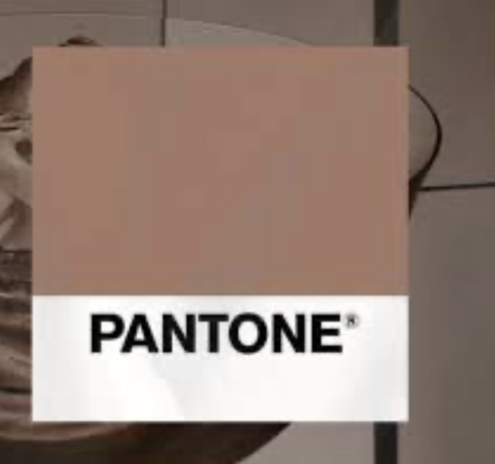
[PANTONE 17-1230 Mocha Mousse, the Pantone Color of the Year for 2025]
Colors of the Years in selling your beautiful gems stone to your clients. In a world recovering from upheaval and uncertainty, this rich brown seeks to embody a return to simple pleasures. PANTONE 17-1230 Mocha Mousse, the Color of the Year for 2025, builds on the themes of comfort and connection introduced by Pantone’s 2024 Color of the Year, Peach Fuzz, while advancing a narrative of quiet luxury. Mocha Mousse isn’t just a color—it’s an emotional experience. Inspired by cacao and chocolate desserts, the shade evokes indulgence, warmth, and nourishment. Its earthy tones also ground it in nature, highlighting themes of sustainability and the organic world.
Mocha Mousse represents a natural progression from the lighter, peachy tones of recent years toward richer, deeper neutrals. It embodies the trend of favoring subtle sophistication over ostentation. This shift aligns with a broader cultural movement toward values like sustainability, mindfulness, and a deeper connection to the earth. Interior designers and brands are already embracing earth tones like this in fashion and retail décor. Mocha Mousse is already making waves in design. From runway collections to interior spaces, this grounding shade is shaping the way we use color to tell stories and create comfort. See how Mocha Moose is used at Pearce Jewelers which I designed.
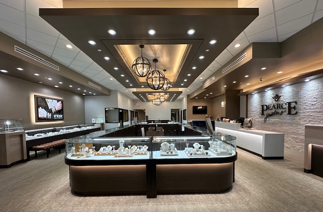
[Pearce Jewelers]
The colors forecasters analyzed global movements in design, technology, travel, and culture to uncover a growing affinity for warm neutrals. With its launch, Mocha Mousse is poised to influence a range of industries—from fashion and interior design to technology and branding—serving as a versatile foundation for creativity. As an adaptable shade, Mocha Mousse enhances interior design jewelry spaces that are both luxurious and inviting. Whether used for an accent wall, upholstery, or flooring, its sensorial warmth makes it ideal for cultivating cozy, harmonious environments. With its connotations of comfort and richness, Mocha Mousse is poised to feature prominently in branding campaigns designed to evoke trust and indulgence. Its understated elegance makes it a modern alternative to traditional neutrals like gray and beige.
The Pantone Colors of the Year is a color trend forecast for the consumer, which means that it is intended to be used for consumers and jewelry products and designs created for clients. Some creative brands renew their look every year according to the new color in reference to the gem color wheel. Therefore, these Color of the Year is meant to be used for marketing and product creation, not necessarily a rebranding. This means that you can create ads with the new color, just don’t change your logo or brand colors.
