
Articles and News


Leslie McGwire: Your Logo’s Part in Your Store Design Story-Part One of Two October 25, 2025 (0 comments)

West Bloomfield, MI-- It’s essential that a physical and pleasing shopping experience start with a good design, so take a good hard look at your overall jewelry space and remember that what you may think are small, overlooked details play an important role in helping a customer understand who you are! Repetition of those details can reinforce your store’s positioning and help keep your store foremost in a customer’s mind.
Take your logo, for example.
This small feature, including the type-font and the colors you choose can be one of your most powerful brandings tools. It can:
- Set you apart from competition
- Convey so much about your store
- Keep customers thinking about you long after they leave your store.
The Logo Grabs Attention
Attention spans are short these days – especially for consumers. As things stand, companies have about 5-10 seconds to convince potential customers that their products are worth any consideration. Enter: Your logo. A logo can quickly grab consumers’ attention and communicate your jewelry company’s core values in an interesting way. That short attention span – you know, the one that causes consumers to judge your business by its appearance –can work to your advantage if you have a solid logo to speak for your company.
For example, think about some iconic jewelry brands and how their logo is designed, as well as how they use it to communicate a message. Tiffany, for example: The classic font with its serif edges, as well as the use of all upper-case lettering says both “strength and establishment”, things that are important to a person spending a good amount of money on something that will last forever and become a legacy. The color blue in more “navy” or “royal” hues is often used by banks and financial institutions wishing to convey establishment. However, the now iconic Tiffany “blue” conveys a more “relaxed” and less stuffy establishment message.
It’s continued use, combined with other details from the Tiffany DNA have come to signify and assure consumers that what comes out of the Tiffany box will bring joy. Further, the repetitive use that color can cause somebody to think Tiffany, even if the physical printed Tiffany name is not present. THAT IS THE POWER OF A WELL-CHOSEN LOGO.
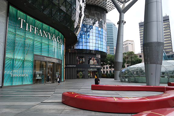
Iconic Tiffany logo on Singapore store location. Photo Credit: istock.com-Wirestock
The Logo Foundation of Your Brand Identity
Successful branding is about telling a story that will influence customers’ emotions – plain and simple. And, while it’s true that logo design is only a part of a company’s brand, it serves as the foundation for the entire narrative on which the brand is built. Colors, tones, and texts all this is determined by the story you’re trying to tell, and your logo sets the stage for this story. These elements will later translate from your logo onto all your branding materials – letterheads, business cards, landing pages, you name it – creating a concrete, marketable brand identity.
But no single logo design works for everybody, and your business is uniquely yours, and your logo should reflect that image. So, there are a couple of things that are important to convey in your logo and what you need to look out for. Remember these things all need to be conveyed with color, type, and graphics!
First: Make it your own!
The proper logo should do the following:
- Reveal your identity (says something about what you stand for)
- Invite new customers to get to know you (easily understood, clear. People are drawn to interesting design elements and colors)
- The logo you choose for your store, your packaging, your receipts, your bags and your advertising should promote interest and encourage people to at least look and hopefully purchase from you.
By the way, that repetition across a variety of in-store, remote and take-away items inspires recall so make sure you are thinking about how your logo will be used across a variety of elements and how it distinguishes you from your competition.
Is Your Logo Scalable
You’ll want to ensure that whatever you choose is scalable both up and down, as well as side to side. Have a graphics person do a variety of sizes and see how it looks on a rectangular background, a square background and how it looks in combination with some of the other logos from the brands you carry in the store.
You’ll also need to think about the color of the backgrounds that your logo might appear on. Have a graphics person place it on a white page, a black page, a few different color pages.
![]()
Logo Treatment at Williams Jewelers of Brookridge in Colorado.
Logos are Memorable
Your logo leads the horse (your audience) to water (your company). Logos are a point of identification: they’re the symbol that customers use to recognize your brand. Ideally, you’ll want people to instantly connect the sight of your logo with the memory of what your company does – and, more importantly, how it makes them feel about jewelry.
Because a good logo is a visual, aesthetically pleasing element, it triggers positive recall about your brand that the name of your company alone might not. And, if we’re all being honest, some of your audience will likely forget the name of your business, but they’ll immediately associate your logo with their memories of your brand.
Some Additional Elements to Think About:
Perhaps don’t use your entire store name all the time, or perhaps create one iconic element, under which you can include (when needed) the entire name.
Using your initials or a picture symbol as the focus of your logo can help create a sleeker more compact iconic style while still giving you the option of putting your name underneath it when needed. This is a popular technique these days in the design world and a style that is used by many companies, such as TD Bank, American Airlines and television networks. It works especially well if your nameis long.
Even if your name isn’t extremely long the creation of an iconic “initial” logo can be quite effective. For example, for Williams Jewelers in nglewood, CO we pulled out the “W” as their iconic logo and placed the full name in smaller type running through the center. This gives them the option to use both. For example, the iconic “W” can be placed perfectly on the outside of boxes, with the full name printed on the inside.
The “W” alone can also work as a subtle branding element on in-case signage or on the wall behind showcases.
Logos Makes a Strong First Impression
You have one chance to get this right.
A logo is a jewelry company’s first introduction to consumers. If designed well, it can pique the interest of the public and invite them to learn more about the company. If not, you’ve just alienated a potential customer base and basically tanked your business.
This first impression is your way to immediately communicate ownership over the product(s) of jewelry you sell or niche you dominate. Your logo introduces your company as an authority in your professional space from the get-go.
When it comes to using your logo, remember that you constantly want to reinforce your brand everywhere possible and ensure that a customer remembers your store. Therefore, the use of your logo should be thought about, whether that customer is standing inside your store, outside your door, or even in their own living room.
Your logo is their constant touch point and reminder of what you stand for, the experiences they’ve had with your business and, in the case of jewelry, the joy you have brought to their lives with your beautiful, quality products.
About the Author: Leslie McGwire™ has over 35 years in tech-business development, interior design, equipment, furniture sales and marketing services in retail and jewelry-based businesses. Leslie has won over 25 national design awards, including the prestigious Salon Today and INSTORE Jewelry Store awards. Leslie has a true passion about businesses to create environments that inspires both customers and staff. Visit lesliemcgwire.com for more information.