Articles and News
Let’s Talk: Common Jewelry Store Design Mistakes and How to Avoid Them | March 22, 2024 (0 comments)

West Bloomfield, MI--Effective jewelry store design plays a crucial role in attracting customers, creating a memorable shopping experience, and driving sales. However, there are common design mistakes that jewelry store often makes, which can hinder their success.
Let’s talk about these common jewelry store design mistakes and provide actionable tips on how to avoid them. By being aware of these pitfalls and implementing the suggested solutions, owners can create a well-designed and customer-friendly retail space that maximizes your business's potential.
Cluttered Store Layout
One of the most prevalent jewelry store design mistakes is a cluttered store layout. Overcrowded displays and excessive merchandise can overwhelm customers, making it difficult for them to navigate the space and find what they need. To avoid this, focus on creating a clean and organized store layout. Utilize strategic product placement, prioritize key items, and allow sufficient space for customers to move around comfortably. Regularly declutter and streamline your displays to maintain a visually appealing and easy-to-shop environment.
Poor Lighting
Inadequate or poorly executed lighting can significantly impact the ambiance and overall shopping experience. Dimly lit areas can make it challenging for customers to examine jewelry, while overly bright lighting can create an unwelcoming atmosphere. To avoid these pitfalls, ensure your store has a balance of ambient, task, and accent lighting. Use lighting fixtures strategically to highlight key areas, such as over jewelry cases and displays and choose lighting that complements your brand image. Regularly assess and adjust your lighting scheme to create an inviting and visually appealing environment.
Lack of Visual Hierarchy
A common mistake in jewelry store design is the absence of a visual hierarchy. Without clear visual cues, customers may feel overwhelmed and confused about where to focus their attention. To avoid this, establish a clear hierarchy in your store design. Place high-demand or featured products at eye level, use discrete signage and displays to guide customers through different sections, and create focal points that draw attention. By guiding customers' visual flow, you can enhance their shopping experience and encourage them to explore your store further. I designed a diamond area with clear signage using light boxes at Jonathan’s Jewelers which is an example of great visual displays. See picture below.
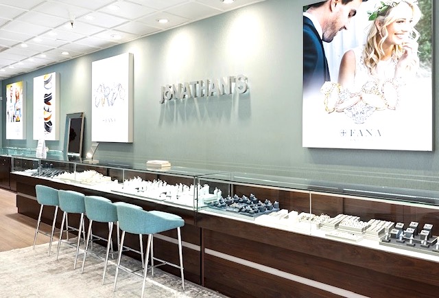
[Jonathan’s Jewelers. Photo credit: Leslie McGwire]
Inconsistent Branding
Inconsistent branding can dilute your brand's message and make it difficult for customers to connect with your store. This mistake often manifests in inconsistent use of colors, fonts, and logos throughout the store. To prevent this, develop and adhere to a cohesive branding strategy. Ensure that your brand elements are consistently applied across all touchpoints, including signage, displays, packaging, and online platforms. This consistency will create a strong brand identity and reinforce customer recognition and loyalty.
Neglecting the Customer Experience
Focusing solely on aesthetics and product displays while neglecting the customer experience is a critical retail design mistake. Customers seek an engaging and enjoyable shopping experience that goes beyond the products themselves. To avoid this oversight, consider the customer journey from entrance to checkout and beyond. Create comfortable seating areas, provide interactive displays or digital elements, and offer convenient amenities like VIP rooms and drink areas. For example, I designed Koerber’s Jewelers using the owner’s quote at their drink area. See picture below. Invest in training your staff to provide exceptional customer service. By prioritizing the customer experience, you can differentiate your jewelry store and build long-lasting relationships with your customers.
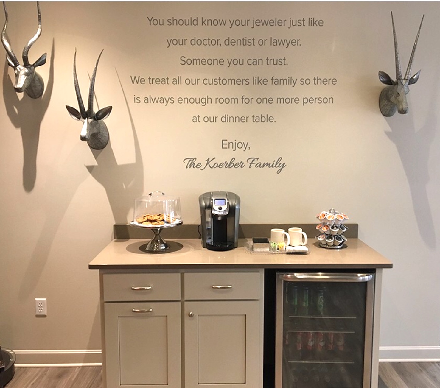
[Koerber’s Jewelers coffee bar. Photo credit: Leslie McGwire]
Avoiding common jewelry store design mistakes is essential for creating a successful and customer-centric store environment. By addressing issues such as cluttered layouts, poor lighting, lack of visual hierarchy, inconsistent branding, and neglecting the customer experience, you can enhance the overall shopping experience, attract more customers, and drive sales.
Keep these tips in mind when designing or revamping your jewelry store space, and regularly evaluate and adapt your design to meet changing customer expectations. With a thoughtful and well-executed jewelry store design strategy, you can set the business up for success in today's competitive jewelry store landscape.
About the Author: Leslie McGwire™ has over 35 years in business development, interior design, equipment, furniture sales and marketing services in retail and jewelry-based businesses. Leslie has won over 25 national design awards, including the prestigious Salon Today and INSTORE Jewelry Store awards. Leslie has a true passion for business, design for the jewelry and retail industries. Visit lesliemcgwire.com for more information.
