
Articles and News


Two Shades Tie For Pantone’s 2016 Color Of The Year December 09, 2015 (0 comments)
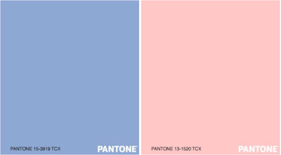
New York, NY—Rose Quartz (13-1520) and Serenity (15-3919) both have been named Pantone’s 2016 Color Of The Year. The first time ever that two shades have been chosen as the key color trend, the softer take comes as consumers seek mindfulness and wellbeing as an antidote to modern day stresses, says a release from the Pantone Color Institute, a global authority on color trends and provider of color systems.
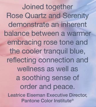
Colors that psychologically fulfill our yearning for reassurance and security are becoming more prominent, says Leatrice Eiseman, executive director of the Institute. Joined together, Rose Quartz and Serenity demonstrate an inherent balance between a warmer, embracing rose tone and the cooler tranquil blue, reflecting connection and wellness as well as a soothing sense of order and peace.
Rose Quartz is a persuasive yet gentle tone that conveys compassion and a sense of composure. Serenity is weightless and airy, like the expanse of the blue sky above us, bringing feelings of respite and relaxation even in turbulent times.
The prevalent combination of Rose Quartz and Serenity also challenges traditional perceptions of color association. In many parts of the world we are experiencing a gender blur as it relates to fashion, which has in turn impacted color trends throughout all other areas of design. This more unilateral approach to color is coinciding with societal movements toward gender equality and fluidity, the consumer's increased comfort with using color as a form of expression, a generation that has less concern about being typecast or judged, and an open exchange of digital information that has opened our eyes to different approaches to color usage, says the Institute. The symbolic color selection is a color snapshot of what we see taking place in our culture that serves as an expression of a mood and an attitude.
Whether in soft or hard surface material, the two colors are appealing in all finishes: matte, metallic and glossy, and join easily with other mid-tones, including greens and purples, rich browns, and all shades of yellow and pink. Add in silver or hot brights for more splash and sparkle. Click here to see suggested pairings and palettes using Rose Quartz and Serenity.
Rose Quartz is the third gemstone-inspired color to be chosen as Color Of The Year in seven years. In 2013, the color of the year was Emerald, and in 2010 it was Turquoise. The last time a soft color was chosen was Sand Dollar in 2006.
In addition to the eponymous gemstone that gave Rose Quartz its name, other gems that reflect a similar hue include kunzite and morganite, while blue chalcedony and iolite are good choices for the Serenity hue.
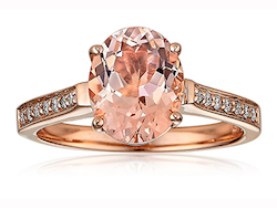
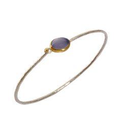
Left, a morganite and diamond ring in rose gold by Makur; right, a silver bangle with blue chalcedony in 24k gold bezel, by Lika Behar.
Click here to watch a video showing how the color choice came about.