Jewelry ECOMM Tech
Improve Your Online Ads With Cleaner Graphics September 04, 2019 (0 comments)
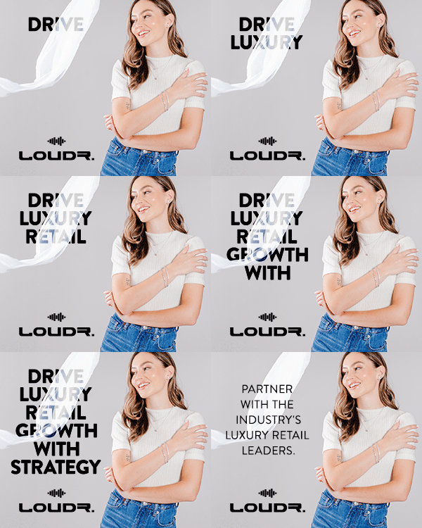
 Clean graphic, simple headline. Not much else.
After years of running ads for a variety of different businesses in different industries - plus managing a handful of online publications like the one you’re reading now - I’ve learned a little bit about what can make or break an ad campaign.
A huge part of the equation is targeting. Targeting the right people with your ads is paramount to your success and there are a plethora of different advanced targeting options to get your gears turning, However, there is a much simpler, non-technical way to attract more eyeballs and get more clicks to your ad - and that’s by designing a cleaner, simpler ad.
Consumers are accustomed to online ads. We instinctively know where the ad locations are on most of our favorite websites. So the only way to really stand out is with a big, bold headline that doesn’t blend in with the rest of the page. Remember - people are scrolling down that page fast. That headline needs to stop their scroll.
If you use lots of wording in your ad, all you’ve done is give the visitor a reason not to pay attention. Nobody wants to read long paragraphs of copy in your ads. Remember - the point of the ad is to bring the visitor to a landing page which contains the full offer or full information. The ad is not the place to explain the details of the product or what you’re selling. That's the point of the landing page, where the ad brings them. The ad is to get them interested enough to learn more. Use your ads as a way to attract visitors to the sales page or landing page, not as a way to instantly sell them in the ad.


