
Jewelry ECOMM Tech


The Major Impact Design Has On Your Website Content February 27, 2019 (0 comments)
We talk a lot about content here at JewelryEcomm.com. Planning and distributing your content properly is the backbone of your digital marketing strategy. However, there's something that I haven't touched on yet that will make a huge impact on whether or not your content actually achieves results - and that's how it looks visually on the page.
Far too often, we populate content throughout our website as if the visitor was reading a book. This is natural - we learn how to write properly in first grade. Though, writing properly for someone reading a book is not the same as writing for someone browsing a website. We can't overwhelm someone with a sea of text.User Experience

Source: https://usabilitygeek.com/user-experience/
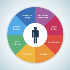
This is a great chart showing some core principles behind User Experience. User Experience means the overall experience your website visitor has while browsing your site. Is your site slow? Is the content organized clearly? Are they able to navigate properly? All these things are considered User Experience. You'll see here, many of these things come down to design. It's one thing for a graphic designer to design a nice flyer. It's another to have a designer who understands how to use those skills on a website. Arranging things intelligently and clearly around your website is going to increase all your goals. Customers will stay on your website longer, will have a much better impression of you, and will absorb what you're trying to sell them.Salted Stone: Website Perfection
Salted Stone is a huge digital agency with offices in Los Angeles, Sydney, Melbourne, Perth, and Cebu. I think their website is digital perfection. You can check it out here: https://www.saltedstone.com/ Their website uses a fantastic sense of design, but they don't overwhelm you. They use great typography, have some really cool animations throughout the site, and really use some cool graphics and colors. However, the most impressive part of the site to me is how easy it is to read. And this is primarily done by using graphics and other elements to break up key points of text. Check it out:
 They do a really fantastic job displaying their key points and services, and they break up each key point with a graphic or different font. This keeps the information digestible and keeps the reader engaged.
We don't want our websites to look like a wikipedia page:
They do a really fantastic job displaying their key points and services, and they break up each key point with a graphic or different font. This keeps the information digestible and keeps the reader engaged.
We don't want our websites to look like a wikipedia page:
 See the difference?
Jewelers and jewelry brands can adapt this same strategy to make sure their website visitors stay connected with their message. What other websites do you think do a good job mixing graphics with text? Let us know in the comments below!
See the difference?
Jewelers and jewelry brands can adapt this same strategy to make sure their website visitors stay connected with their message. What other websites do you think do a good job mixing graphics with text? Let us know in the comments below!