Sales Strategy
Better Strategies For Using Signage In Your Jewelry Cases | September 26, 2018 (0 comments)

Omaha, NE---In-case signage can be a very helpful tool to enhance your product, communicate with your customers and, most importantly, tell a story. Always assess your signage to make sure that it is consistent with your store brand and image. Here are 20 tips to getting better results from your in-case signs.
Keep In Mind:
- Too much pricing or signage combined with multiple slot trays create a “mall store” look. Again, less is more.
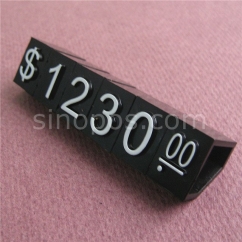
- Some pricing is recommended so your customer has a sense of affordability, but use sparingly, and use groupings of “starting at $495”, etc.
- If you have unique, interesting or proprietary product you will want to highlight them with signage.
Signage Basics:
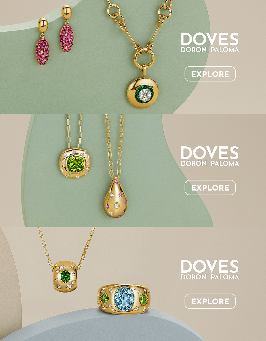
- Signage could be a designer name, a collection name, a collection tag line, visuals and images, store features and benefits, or even pricing. Every showcase should have some kind of signage.
- The primary sign should be at the front and in the center of the case. Other signage can be on or beside your platforms.
- Changing out your signage seasonally is another way of keeping your showcases fresh looking.
- Keep signs free of fingerprints or any evidence of wear and tear.
- Never use hand-made or hand-written signs. Have a printer create them for you.
- Signage should always have a holder which matches your displays. An exception would be some pricing modules.
Tell a Story:
- Each showcase, or platform within a showcase, should be a “storyboard” in itself.
- Jewelry should not be displayed based on their components - example: all 1 pc. Semis grouped together, and all 2 pc. Semis grouped together. They should be grouped by look and feel (design), because that is how a customer shops.
- Group your product into collections that tell a story. For instance, you could display a collection of amethyst, citrine and smoky quartz jewelry and sign it “Brazilian Beat”. Add some gemstone rough, and you have a story that is relevant and interesting to your clients.
- A tagline gives the client more information about the grouping or Collection – ex: The Eclat Diamond Collection – “Superior Brilliance Your Eyes Can See”.
- Add a framed bio with image for each of your designers. Sales associate need to make a designer come alive, so these are a great prompt.
- Add framed visuals to each case – example: A romantic sepia photo of a couple embracing in your bridal case. Or, an image of a celebrity wearing large hoops with your hoop earring collection.
Positioning the Stories
- Always work from the center out. The merchandise displayed should “flow out” from the center.
- Assume the customer is standing in front of the case, so arrange the merchandise to face the customer. If a lighting baffle blocks the view, make sure the platforms and elements are toward the back of the case.
- Try to balance each story so that it’s not weighted on one side or another.
- Space items so that the eye is forced to focus on one item – or a group of items before moving onto the next group.
- Curves lead the eye more effectively than hard lines, so try to incorporate curved shapes into your story.
The Edge Retail Academy provides customized strategies for retailers and vendors to increase profits, optimize growth, reduce debt, create profitable inventory solutions, build effective teams, and enhance brand loyalty and profitability. Edge Retail Academy software and the unique talent pool of their business advisors provide real world knowledge and advice for better bottom line results, all on a “no-contract” basis. If you would like more information or strategies on this or any other topic, please contact us. 877-569-8657, ext. 1, Becka@EdgeRetailAcademy.com or www.edgeretailacademy.com


