Articles and News
EXCLUSIVE DIGITAL MARKETING SERIES, PART 3: HOW TO BOTH SAVE MONEY AND GET A BETTER WEBSITE | August 10, 2011 (3 comments)

Las Vegas, NV—Website design is arguably the most important aspect of your Internet marketing efforts, yet it is one of the most misunderstood. Put simply, what your customers see and what the search engines see are two different things. Understanding this difference will not only make your site far more effective, it also can save you thousands of dollars in web design costs.
The jewelry industry, especially at the luxury level, is highly visual, lending itself to heavy use of images, graphics, and Flash animation online. While good visual design is critical to grabbing customer attention and maintaining your store’s image online, it’s not what will make your site come up higher in a search. Search engines, such as Google, are blind. They see the framework and back-end coding of the site, not the front-end visuals.
Unfortunately, business owners often don’t know what to ask their web designer. Do your conversations with your web designer sound something like this? “Ok. Thanks. Well, you are the expert at this, so please make sure it looks good and it works.” While you can view a site and see how nice it looks, if you don’t know some of the terms and items to watch for, you may be spending a lot of money for a site that is beautiful but nearly invisible to search engines.
First, let’s talk about some of the core coding that goes into a site. One of the easiest pieces of information to include on your site is the meta data (the hidden data on your website that helps the search engines). The meta data includes the page title, keywords, and a description, and it should be different for each page of your site. Make the content in the meta section relevant to that particular page (relevance is important to Google).
- Page Title– This is the title of that page that shows up in the top left hand section of your web browser. This tells Google what your page is really about. You want to keep this short – typically only the first 60 characters are recognized, so you want to be sure to have your prime keywords at the beginning of the title. Commonly, the use of the pipe (|) symbol is used to differentiate key phrases. For example, our site says: Retail Jewelry Consulting Services | Training | Focus Business Management Institute. The first 60 characters end in the word ‘business,’ so my key elements for this page are found.
- Keywords– This will contain a short list of the main keywords that you want the search engines to know about your site, so that they can accurately drive traffic to your site. This is where you would put “jewelry, [your city], [surrounding cities], engagement rings, [a few zip codes].” You don’t want to put too many keywords in here, as that is called ‘keyword stuffing’ – the equivalent of coding ‘spam.’ A good target is 8-10 keywords per page.
- Description– This is the description that shows up under your link when someone finds your site in Google. Be sure to think about this, because this is a great way to capture someone’s attention when they are doing a search. Only the first 160-characters show up in the search results, so put something catchy in the description section so they are enticed to click on your link. Our page example listed above has a description that is more than 160 characters, but this is what shows in Google: We provide our clients with unlimited access to basic and advanced seminars and workshops throughout the year. We offer leading edge information to grow ...
The above items are quickly edited and changed and have a small impact on your site, but more important is the content on your site and the method of delivery to your viewers.
Flash for your cash? Since jewelry is a visual business, many jewelers are mesmerized by the beauty of how a Flash website can help show off their products. Flash is animation software created by Adobe, and it looks amazing. But as visually appealing as animated banners, images, and slide shows may be, Google doesn’t see it. Remember, Google is blind. It can’t see images—only text—so you have to be sure that your site appeals to Google’s methods if you want to gain web traffic.
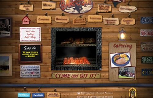
I’ll use an example of how Flash is viewed by Google with a site outside the industry. C&J Barbeque (www.cjbbq.com) has a really nice site, shown below. It looks ‘homey’ and fits their company well. They have a rotating smoker-pit in the middle with images for their menu, locations, specials, catering, etc., along with links to their Facebook and Twitter accounts. At first glance, you would think this is a great site that the search engines would love.

What the viewer sees on C&J Barbecue's homepage.
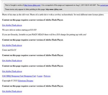
However, let’s look at what Google sees on C&J Barbecue's homepage, below:

As you can see from this image, Google doesn’t see any of the items the viewer sees. It sees “Get Adobe Flash Player” numerous (five) times. Only one item has a link to C&J BBQ—and that’s their shopping cart page (fourth line from bottom). I’ve seen a lot of jewelry websites that simply show “Get Adobe Flash Player” as the only text on the page. As far as Google is concerned, this page means nothing--about barbecue or jewelry.
Be sure that your website is being designed in HTML (or at least being read by the search engines as HTML) and it not totally dependent on Flash technology. Implementing Flash for a few images is not a big problem, but you should consider posting them in a different media format if you want the site to be viewable by all viewers. The upcoming new development standard is HTML5. It is designed to handle all types of media more effectively than the last version of HTML, so I would recommend using that.
Important to note is that Flash is not viewable on Apple mobile products, so not only is your beautiful site invisible to Google, but it’s simply a blank page when viewed on an iPad or iPhone. At the recent IJO show in Nashville, I was talking to a prospective client and they told me that if they had known the above information it would have saved them several thousand dollars on a redesign of their website.
As I mentioned, Google is blind. However, it does read the names of the items on your pages, so be sure that you name your images appropriately. For the pictures you have posted on your site, be sure that they have a name that is important to your site. Don’t name images ‘photo1.jpg’ – use ‘ABC_jewelers_Farmington_engagement_ring.jpg”. Google will pick up on the keywords of ABC Jewelers, Farmington, and engagement ring and help your site show up in both the text and image search results. Also, have your designer reduce the resolution of your images to 72 dpi so the images load more quickly. This helps enhance the user experience (and Google is now starting to consider page speed in their analysis of your site).
Be sure that you have a sitemap and robots.txt file on your site and that you feed this information to Google. I’ll cover more on this in the next installment, but I wanted to mention it here.
Don't lose your audience. Finally, don’t redirect your site to another company’s site. I have seen far too many jewelry sites that have a link for a supplier’s brand that directs the customer to that brand’s site. Instead, work with an inline frame on your site. This is kind of like a ‘site within a site’ (or ‘picture-in-picture’ on your television) and will keep people on your site. You basically show the other site’s content within the framework of your own site. Just as you wouldn’t send your customer out the door to a competitor, you never want to send someone away from your site.
Jeffrey W. Arnold is a business consultant for Focus Business Management Institute, an industry leader in retail jewelry consulting. Arnold has helped increase the profitability of numerous companies, ranging from start-ups to multi-billion-dollar entities. He now conducts social media and Internet marketing seminars for retail jewelers and leads the marketing initiatives for Focus. For more information on Focus and how they help increase profitability for independent jewelers, visit www.FocusBMI.com


