Articles and News
Let’s Talk Jewelry Store Design: The Importance of Ceiling Design | December 03, 2020 (0 comments)

West Bloomfield, MI--When starting a new interior design project for a jewelry store, many of my clients ask me the question: What should the ceiling look like? This is a huge decision because the ceiling design will be noticed the minute the client walks into the store. As I have said many times, “First Impressions Are Everything.”
There are many different design styles that we can choose from for the ceilings. The most popular designs are the sheet rock/drywall and acoustical tile ceilings.
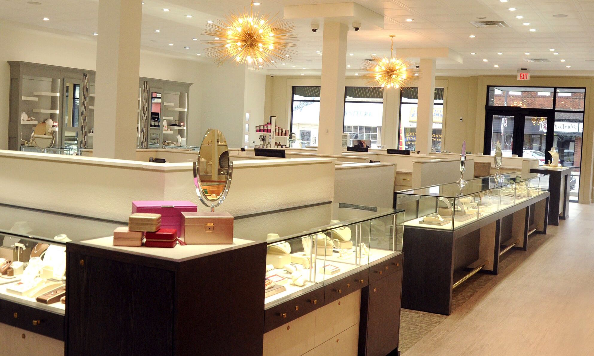
First, let’s talk about acoustical tile ceiling. It was popular in the past to use 2’ x 4’ ceiling tiles. In the past five years, we have seen much more 2’ x 2’ ceiling tile, which most all-new construction projects use. The best design decision is to paint the tile and the grid a color. This creates a more high-end feel to the space. If my clients want to go with the color white, I specify the Armstrong 2’ x 2’ Vector #1904 Ultima. The main reason is because the ceiling looks most like drywall with very little texture at all in the tiles. Kelley Jewelers in Weatherford, Oklahoma used the ceiling design below.
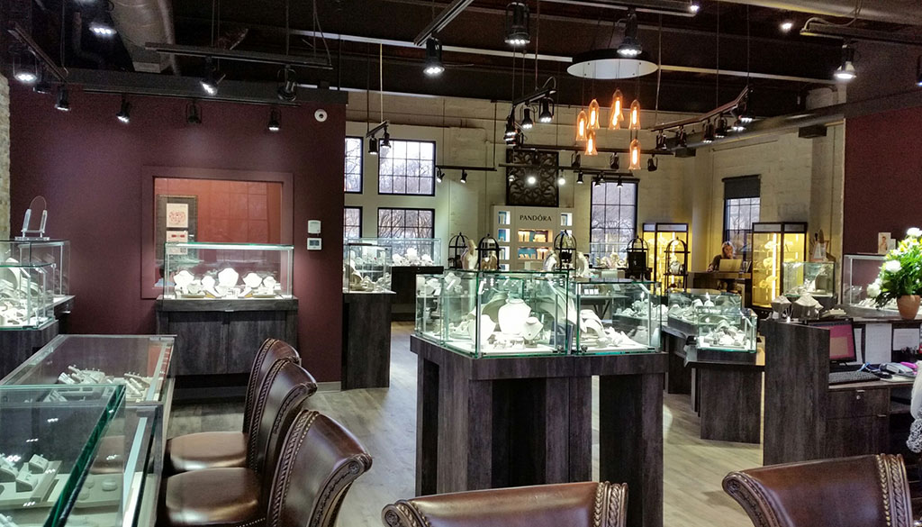
Another popular interior design for contemporary jewelry stores is an open grid ceiling where you see the ceiling mechanical system, such as sprinklers, ducts, and HVAC systems. My client and owner Bill Welling came to me and said I want my jewelry store to look like Starbucks. Yes, we designed an open ceiling that complemented the casual atmosphere, shown below. This jewelry store is Welling & Company Jewelers in West Chester, Ohio.
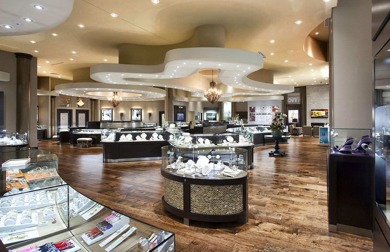
My favorite design is the drywall ceiling. For example, for Crocker’s Fine Jewelry in Texarkana, Texas I dropped the ceiling in different areas of the space, which helped the client highlight the focal points below. I also outlined the jewelry case shapes below, which gave the ceiling design an intimate feeling right when you walk into the store. One of my signature designs in dropping down soffits and ceilings is to use paint inside the different levels to coordinate to the below color scheme in the overall design of the store.
I would like to end this article by quoting my favorite retail author Paco Underhill:
“Ceilings are so important to retail stores. Presentation is often about impressive design ideas in the ceilings. By lowering the ceilings these important areas help foster the sale.”
About the Author: Leslie McGwire™ has over 35 years in business development, interior design, equipment, furniture sales and marketing services in retail space, salons, resorts, spas, and jewelry-based businesses. Leslie has won 25 national design awards, including the prestigious Salon Today and INSTORE Jewelry Store awards. Leslie has a true passion for business, design for the jewelry, and retail industries. Visit lesliemcgwire.com for more information.
