
Articles and News


“Radiant Orchid” Is Pantone’s Color Of The Year For 2014 December 18, 2013 (0 comments)
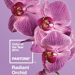
Carlstadt, NJ—Pantone, an X-Rite company considered the global authority on color, announced “Radiant Orchid” (left) is its Color of the Year for 2014. The color, which carries the registered trademark number PANTONE 18-3224, is a vibrant purple hue achieved by blending fuchsia, purple, and pink undertones.
“Radiant Orchid inspires confidence and emanates great joy, love and health. It is a captivating purple, one that draws you in with its beguiling charm,” said Leatrice Eiseman, executive director of the Pantone Color Institute. “While the 2013 color of the year, Emerald, served as a symbol of growth, renewal and prosperity, Radiant Orchid reaches across the color wheel to intrigue the eye and spark the imagination. An invitation to innovation, Radiant Orchid encourages expanded creativity and originality, which is increasingly valued in today’s society,” she continued.
The color’s rosy undertones radiate on the skin, producing a healthy glow when worn by both men and women, says Eiseman. Because it blends both cool and warm undertones, it is flattering to many hair, eye, and skin tones. It pairs well with red, and sister shades of lavender, purple, and pink, providing a broad palette of cosmetic color options for women, and it also complements olive and hunter greens, turquoise and teal, and even light yellow, and livens up neutrals like beige, gray and taupe, making it a highly adaptable color for home accessories, paint, and interior design.
It already was popular on the runways during the spring/summer 2014 ready-to-wear shows in September, and is making its way onto the red carpet. Look for variations of the hue to carry into both men’s and women’s clothing and accessories throughout the coming year.
Pantone’s annual Color Of The Year is one that’s trending up in design, both fashion and commercial. To determine its choice, Pantone evaluates color influences from around the world, such as from the entertainment industry and films that are in production, traveling art collections, hot new artists, popular travel destinations and other socio-economic conditions. Influences may also stem from technology, availability of new textures and effects that impact color, and even upcoming sports events that capture worldwide attention.
For more than a decade, Pantone’s Color of the Year has influenced product development and purchasing decisions in multiple industries, including fashion, home and industrial design, as well as product packaging and graphic design. Past colors include: Emerald (2013), Tangerine Tango (2012), Honeysuckle (2011), Turquoise (2010), Mimosa (2009), Blue Iris (2008), Chili Pepper (2007), Sand Dollar (2006), Blue Turquoise (2005), Tigerlily (2004), Aqua Sky (2003), True Red (2002), Fuchsia Rose (2001), and Cerulean (2000).
Here is the entire palette of colors Pantone has identified as most prominent hues for spring/summer 2014:
- Placid Blue, is like a picture-perfect, tranquil and reassuring sky, induces a sense of peaceful calmness.
- Violet Tulip is a romantic, vintage purple that evokes wistful nostalgia.
- Similar to the verdant shade of springtime foliage, Hemlock is a summery, ornamental green that's very different from the greens of recent seasons. Pair any of these versatile pastels with a bolder hue for an au courant look, says the Institute.
- Sand, a lightly toasted and amiable neutral, conjures images of the beach and the carefree days of summer.
- Paloma serves as a quintessential neutral, interesting enough to be worn alone or combined with any color for sophisticated poise.
- Cayenne, a high-pitched red, adds a dash of spicy heat to neutrals and plays well with Freesia.
- Freesia is a blazing yellow tropical, floral-inspired shade.
- Celosia Orange is an optimistic, spontaneous hue. Pantone suggests pairing it with Violet Tulip.
- Radiant Orchid is the bold counterpart to Violet Tulip.
- Dazzling Blue is the scintillating opposite to Placid Blue. Both these strong, vibrant colors pair well across the palette: they are perfect companions to pastels, and add confidence and vivacity when mixed with other bold colors.
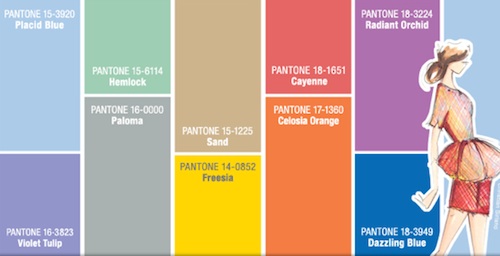
Chart source: Pantone