Articles and News
SEVEN FAST, EASY WAYS TO BOOST ROI ON EMAIL MARKETING | March 28, 2012 (1 comment)

Totowa, NJ—What’s the most immediate way a jeweler can get more customers to read emails? To find out, The Centurion asked Matthew Perosi, SEO analyst and founder of Jewelers Web Advisory Group (jwag.biz). Jwag is the free-advice arm of Jewelerwebsites.com, the company for which Perosi also serves as president.
Perosi offered seven tips for bumping up your email numbers almost immediately. But what’s the fastest fix? Hint: It’s very simple, and probably not what you think.
Tip #1: The most immediate way to boost the number of customers who open your email is by making sure your opening graphic—your logo or store photo or whatever—is visible in the recipient’s email. If it isn’t, be sure your alt text (what people see if they don’t see the image), reads “if you don’t see our logo (or photo or whatever), please click ‘view images’.”
Open rates are controlled via the images coming through, and the recipient has to open the email and view the images to be counted, says Perosi. If viewers don’t see an image, they’re not likely to stay, but if they get a message that directs them to click “view images,” they are more likely to stay than if they see text that says “jewelrystorelogo.jpg.” Once they do click on “view images,” hopefully they’ll also click on the text that says “always view images from this sender,” which means you’ve now got them for all future emails.
Perosi has tested this theory repeatedly and swears it works. A self-professed data geek, he is in the middle of studying more than 2,000 marketing emails from both large and small jewelry stores and big sites like Blue Nile and Tiffany & Co., collected since holiday 2011. He’s opening each email, clicking around, and compiling all that information into a report that he will be sharing at a seminar at the upcoming JCK Show in Las Vegas.
On jewelerwebsites.com, the company’s salespeople post their photos with their emails. The alt text for one, named Jen, says “This is Jen’s photo. She’s waiting for your call. Click “view images” to see her.” Text like that, with its gentle humor, can work very well for a jeweler, says Perosi.
Tip #2: Deliver what the customer signed up for. If you ask customers to sign up for your monthly email newsletter, they expect a newsletter with editorial content, not a sale flyer.
It’s a common mistake. “Most jewelers who send “newsletters” are really sending sales solicitations,” Perosi says. “Even big players like Blue Nile send ads with very little editorial content.” There’s nothing wrong with it—as long as the customer signed up to receive special offers, not a newsletter. Product pitches can be part of a newsletter if delivered in an informational manner. Perosi cites an example of a jeweler who had a special on pearl necklaces and wrote an article on the culturing process, with photos of oysters and so forth. Of course the special sale was included but it came off as news.

Tip #3: Stay consistent. Of 100 jewelry stores’ emails Perosi tracked recently, he says 70 simply stopped emailing. No newsletters, not even any special offers.
“I open every one [I got], so they can track me, and there’s no reason they shouldn’t keep sending them to me. It tells me they’ve given up,” he says. Yet of the other 30, some stores sent out five or six emails a week, and others sent at least one per week, but all were consistent. Perosi observed stores who send real newsletters are still doing it, while the stores that only sent special offers are the ones that dropped off—including Blue Nile, he says. Tiffany also only sends sales-related emails, he says, but they are consistent.
The jewelers’ email lists that he’s observed typically have between 300 and 400 addresses, and typically get about 50-64 opens, or roughly a 16% open rate. This is higher than both the average 11.4% open rate for all industries and the 12.1% open rate for retail email (according to data from mailermailer.com).
Is it possible the stores that stopped sending email solicitations have shifted to Facebook for those announcements?
“That’s the subject of another research project we’re working on,” laughs Perosi. “But we already found that it’s far more effective when a fan posts something about a store on Facebook than if the jeweler posts it himself.
“For example, if your website says ‘20% off on opal jewelry, click here to browse the catalog,’ and a customer posts to the wall to be sure and check out the opal catalog, a lot more fans are going to rush over.”
So how does one guarantee an enthusiastic fan will show up at just the right moment? “There’s always an audience plant,” suggests Perosi.
Tip #4. The rich are different. They have more money. “Lots of people try to do analyses of phrases that work for luxury vs. other consumers,” says Perosi. He’s not entirely convinced there are special words, even ones like “exclusive.” But one thing he is certain of is that a luxury consumer is not pinching pennies, and an email is not the place to shout out prices.
“You want to give just enough of a teaser to get them to click through to your website,” Perosi says—but once there, prices are an absolute must.
“That’s where you show the matching pieces, the price alternatives, and so forth. The email shows a big diamond ring; the customer knows it’s going to be expensive. Maybe the guy wasn’t planning to spend $50,000 on a diamond ring this Christmas. But the email is to entice him to the website where he can see a variety of rings at different prices.”
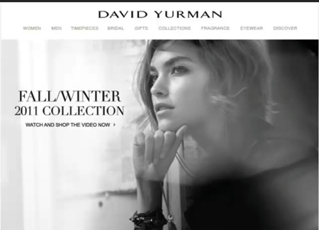
Another idea he likes is animation. “It’s an older technology but a good one,” says Perosi, citing a holiday 2011 email he received from David Yurman, where a model was wearing a long necklace and swinging the pendant. The pendant’s motion was captivating, he said.

This image from David Yurman was visible in Perosi's email from the company--and the pendant was swinging even before he clicked on it.
Tip #5. Harness the power of the long tail. Typical metrics for email marketing show the first hours are the most critical for opens, but your emails can still do powerful work for you later. (A “long tail” refers to incremental increases after the initial effort.)

Perosi says tracking research he’s done since 2009 shows that emails have impact long after the first shot—if they don’t disappear. Some servers only keep an email for 30 days, but jewelers who send newsletters should immediately also archive them to their website or on a blog because the more content Google sees—and the more it sees you adding new content—the more often it comes back to your site and the more often it sends visitors to your site.
“If you spend time making an editorial newsletter, post it on your site because the number of people seeing it over time far exceeds the open rate or the click rate,” Perosi says. For example, if you’re a Pandora dealer and you send out a monthly Pandora special promotion email, archive them because after they’re posted to your website, you’ll have a robust sub-site dedicated to Pandora, and Google will send anyone in your area searching Pandora your site.
Tips # 6 and #7: How to do mobile right the first time. Mobile is the next digital marketing frontier and it’s burgeoning. Not surprisingly, Perosi is doing heavy research into it—including spending half his time in France, where mobile marketing is about five or six times ahead of the United States, he says.
The two most important things jewelers need to know about mobile: tip #6, make sure your mobile site is a bona-fide mobile site, not just a PC website that can be accessed on the go; and tip #7, having a proper mobile site is more important than having an app. Get these two right and you’re well on your way.
“A mobile site is one that can be read easily on a smart phone at arm’s length and navigated by thumb while the other four fingers are holding the phone,” says Perosi. It’s not like a regular PC site that you have to pinch-zoom to see on a mobile device.
He’s been known to kick his employees out of the office with a smart phone in hand and marching orders to “go take a walk and navigate that site with one thumb, from arm’s length.” If it can’t be done or it can’t be seen at a distance (think 18-point font), it’s back to the drawing board for the site. And test it on both Apple and Android phones too, he says—it has to work on both.

Finally, don’t rush to create a special app, he says. Mobile-savvy consumers are more interested in a good mobile site they can go to quickly for what they need and get rid of when they’re done, rather than having to download an app they’re going to use only occasionally.


