Articles and News
Step-By-Step Guide: How To Use The ‘Google My Business’ Smartphone App | July 22, 2015 (0 comments)

Totowa, NJ--1,300 weekdays ago I wrote my first Daily Nugget about Google Maps. In honor of my first topic, I now write about Google Maps and its subsequent incarnations ever since, and save them for these milestones.
The original Maps service has transformed several times through the years and had names like Local, Places, Local Business, and Google+ Local. Ever since Google started using Google+ to tie all its services together, the previous nomenclature didn't make sense. There were too many different services that business owners needed to tap in to that didn't make sense for name like "+Local."
Thus, Google My Business was born. GMB isn't a specific feature that everyday users will ever see, or even know about. It's simply the website interface that allows you to edit all your business settings. This includes your +Local Listing, AdWords, Reviews, and a lot more.
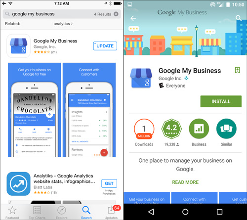
This website interface works very well through a web browser, but as the world becomes more mobile, Google has put a lot of effort into creating a mobile version of GMB for iPhones and Androids. (Please note that all of the following side-by-side screen shots shows the iPhone 6 on the left and the Google Nexus 5 on the right.) As you see here, you can go into the Apple App Store or Google Play and search for "Google My Business" to install it:
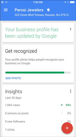
Every once in a while, Google will automatically update your business information. They notify you of those updates with the green message saying "Your business profile has been updated by Google" as you see in this screen shot:
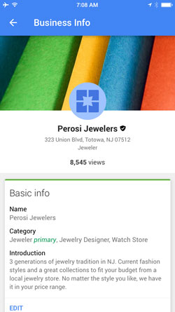
Tap that message to see what they updated as shown below. In this case they changed the business category to make "Jeweler" the primary category. Notice the word "primary" in green:
Here's what the first screen would look like when you don't have one of those update messages:
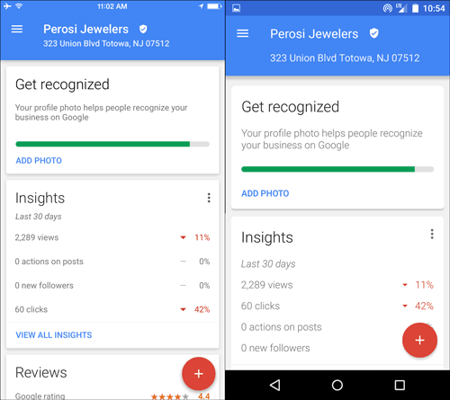
Notice how the app displays groups of data in a white box with a border and a shadow. This display format has become widely used throughout all of Google's mobile apps. Those white boxes are called "cards." The first card shows your Insights for the last 30 days. We have 2,289 views and 60 clicks. Notice the difference between the iPhone and the Android layouts. Tap the Insights card to see the 30 day chart:
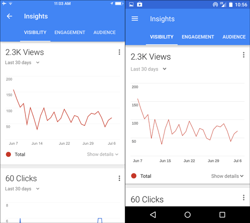
There are three words across the top: Visibility, Engagement, Audience. You can tap any of those to see more information. The default view shows the Visibility chart that shows you how often your website appeared in search results over the last 30 days. You can tap the small gray "Show details" link below the chart to reveal the breakdown of search type that you see here:
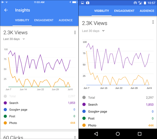
The breakdown includes the number of times your website appeared in normal search results, how many times your product photos appeared in search results, how many times your Google+ Page was viewed, and how many times your Google+ Posts were viewed. Scroll down a little bit to see the number of times people have clicked on your website from those search results:
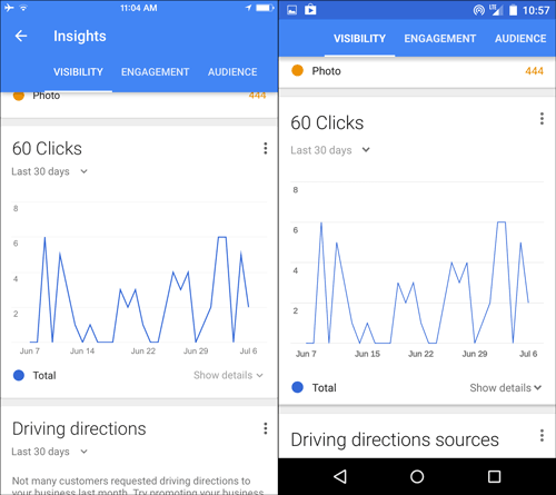
Once again you can tap the small gray "Show details" link below the chart to reveal the breakdown of clicks that you see here:
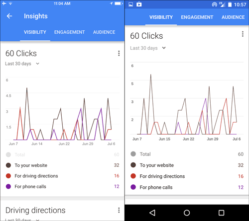
For the 32 people who clicked "To your website" and the 16 people who clicked "For driving directions" there's no way to tell if they were using a desktop or a smartphone. On the other hand, as of today, the feature to tap "For phone calls" is only visible through a mobile device, so those 12 people must have tapped to make a phone call.
Continue scrolling until you see the card for "Driving directions" and the card for "Phone calls." Most jewelers won't see details for driving directions because not enough people request them. Due to privacy restrictions, Google is not able to display this information until they reach a certain threshold... Which is obviously higher than 16.
The default display for the "phone calls" card on the iPhone clearly shows the total number of callers. I have it set to the last 12 weeks to see there were 71 total calls. Take a look:
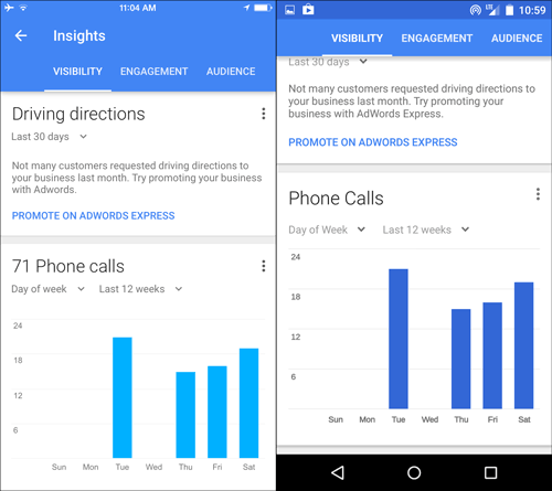
The bar chart shows the popular days of the week when people called. You can change the display from "Day of week" to "Time of day" to see when your phones are ringing off the hook:

Instead of showing 71 calls now, this chart says 45. That's some strange Google math. Another strangeness here is the difference in the scale of this chart between the iPhone and the Android. Because of the change in scale I can't quite tell if it's reporting the same information. Regardless, you will see when you get the most phone calls, which is 1PM in this case.
There's a lot more information available within the Google My Business App, just explore and discover. They created this to be a handy tool for you to monitor important online business information, especially your reviews. You can also edit your company information and post updates to Google+ through the app if you feel so inclined.
Matthew Perosi has been a professional web developer since 1994. He is founder and president of jWAG (Jeweler Website Advisory Group) and Jeweler Websites Inc. After six years of monitoring web traffic, trends, and data while helping jewelers build their sites, he created jWAG to help all jewelers benefit from what he and his colleagues learned. Perosi is a frequent speaker at industry events and you can subscribe to his Daily Nugget Blog here.


